1. Getting Started
Codion applications follow a consistent design pattern that makes it easy to work with data once you understand the basic layout and concepts.
1.1. Application Layout
The application window is organized into panels that work together to display and edit your data:
-
Table Panel - Displays data in rows and columns, located in the upper part of the window
-
Edit Panel - Shows detailed fields for a single record, typically above the table
-
Search Panel - Filters table data, can be shown/hidden above the table
-
Filter Panel - Dynamically filters currently visible table data, can be shown/hidden below the table if included
-
Detail Panels - Show related data in tabs to the right
1.2. Understanding Master-Detail Relationships
Data in Codion applications is usally organized in master-detail relationships. For example:
-
When viewing customers (master), you might see their invoices (detail) in a tab to the right
-
Selecting a different customer automatically updates the invoices shown
-
You can work with detail data without leaving the master record
This hierarchical structure can go several levels deep, with each level showing related information.
1.3. Basic Navigation
You can navigate the application using either keyboard or mouse:
-
Between panels - Click into a panel or use Ctrl+T for table, Ctrl+E for edit panel
-
Between fields - Press Enter or Tab to move forward, Shift+Enter or Shift+Tab to move backward
-
Between tabs - Click a tab or use Ctrl+Alt+←/→ to navigate left/right
-
Within tables - Use arrow keys to move between rows and columns
|
Tip
|
Codion applications are designed for keyboard-first navigation. Once you learn a few Keyboard shortcuts, you can work much faster without reaching for the mouse. |
|
Note
|
On macOS, use ⌘ (Command) instead of Ctrl for keyboard shortcuts. |
2. Working with Data
2.1. Viewing Data
2.1.1. Table Basics
Data is displayed in tables with rows and columns.Each row represents a single record, and columns show different attributes of that data.
-
Selecting rows - Click a row or use arrow keys to navigate
-
Viewing details - Select a row to see its full details in the edit panel above
-
Multiple selection:
-
Ctrl + Click to add or remove individual rows from the selection
-
Shift + Click to select a contiguous range of rows
-
Ctrl + ↑/↓ to navigate without changing selection, then Space to toggle the selection of individual rows
-
2.1.2. Sorting Data
You can sort table data by clicking column headers or using Keyboard shortcuts:
-
Sort by single column (keyboard) - Use Alt+↑/↓ with focus on that column
-
Alt+↓ cycles through: unsorted → ascending → descending → unsorted
-
Alt+↑ cycles through: unsorted → descending → ascending → unsorted
-
-
Sort by single column (mouse) - Click the column header
-
Click cycles through: unsorted → ascending → descending → unsorted
-
Shift + Click reverses iteration: unsorted → descending → ascending → unsorted
-
-
Multi-column sort - Use Shift+Alt+↑/↓ (keyboard) or Alt + Click (mouse) to add another column to the existing sort order
-
Clear all sorting - Sort by a single column (this clears any multi-column sort) then cycle that column back to unsorted
|
Tip
|
Sorted columns show a small arrow indicator in the header (↑ for ascending, ↓ for descending). |
2.1.3. Finding Text in Tables
To quickly locate specific text within the current table data:
-
Press Ctrl+F to focus the search field at the bottom of the table
-
Type the text you’re looking for
-
Press Enter or ↓ to find the next match
-
Press ↑ to find the previous match
-
Add Shift to the navigation keys to select matches as you find them
|
Note
|
This searches only the data currently loaded in the table. Use the column condition panel (see Searching) to filter the full dataset. |
2.1.4. Master-Detail Relationships
When working with related data:
-
Selecting a record in the master table automatically loads its related detail records in the tabs to the right
-
You can add, edit, or delete detail records without leaving the master record
-
Changes in detail panels are independent - you can work with invoices for one customer, then switch to another customer
|
Tip
|
If you’re working with a large dataset in the master table and notice that selecting records is slow due to detail data being loaded, you can hide the detail panel to temporarily unlink it from the master. This prevents the detail panel from responding to selection changes, allowing you to navigate quickly through the master data. See Detaching Panels for how to show and hide panels. |
2.2. Adding Records
2.2.1. Starting a New Record
To add a new record:
-
Click the Clear button or press Alt+C in the edit panel if required
-
Fill in the fields (watch for validation indicators showing invalid values)
-
Click Add or press Alt+A to save
|
Note
|
By default, foreign key fields (relationships to other tables, e.g. drop-down or Search Fields) keep their values when you clear the form. This makes it easy to add multiple related records. However, this behavior can be configured differently by the application developer. |
2.2.2. Filling in Fields
-
Validation indicators - Fields with invalid values are highlighted with validation styling (dark background with standard Look and Feels, border highlighting with FlatLaf)
-
Drop-down lists - Click to open, or start typing to use auto-complete
-
Date and time fields - Type the value or press Insert to use the calendar picker.Use ↑/↓ to increment/decrement the value at the cursor position (year, month, day, hour, minute, etc.)
|
Tip
|
Press Enter to move to the next field quickly.The form is designed for rapid data entry using only the keyboard. |
2.2.3. Search Fields
Search fields allow you to search for and select related records.They are particularly useful when dealing with large datasets where a drop-down list would be impractical.
Basic Usage
-
Type your search text in the field
-
Press Enter to search
-
If exactly one record matches, it is selected automatically
-
If multiple records match, a selection dialog appears
-
If no records match, an informational message is displayed
|
Note
|
The field background color changes when the search text differs from the current selection, indicating that a search is needed. |
Search Behavior
-
Single selection fields - Enter a single search term
-
Multiple selection fields - Enter multiple search terms separated by commas
-
Automatic search - By default, a search is performed when the field loses focus (only auto-selects on single result to avoid interrupting focus traversal)
-
Cancel search - Press Esc to cancel your edits and restore the current selection
|
Tip
|
If you clear the search field and press Enter or move focus away, the selection will be cleared. |
Search Settings
Right-click on a search field to access search settings:
-
Case sensitive - Enable to make searches case-sensitive
-
Prefix wildcard - Automatically add a wildcard before your search text
-
Postfix wildcard - Automatically add a wildcard after your search text
-
Space as wildcard - Treat spaces in your search text as wildcards
-
Result limit - Limit the maximum number of search results
|
Note
|
Search settings are configured per search column and are saved in your user preferences. |
Adding and Editing Related Records
Some search fields have Add and Edit buttons that allow you to create or modify related records without leaving your current form:
-
Add - Press Insert to open a dialog for adding a new related record
-
Edit - Press Ctrl+Insert to edit the currently selected related record
After adding or editing a related record, it is automatically selected in the search field.
2.3. Editing Records
2.3.1. Selecting Records to Edit
-
Click a row in the table to load it into the edit panel
-
Or use arrow keys to navigate to the desired record
-
The edit panel will display all fields for the selected record
2.3.2. Making Changes
-
Modify any fields in the edit panel
-
Click Update or press Alt+U to save your changes
-
Confirm the update in the dialog that appears
-
Or click Clear (Alt+C) to discard changes and reload the original values
|
Note
|
If the application is configured to warn about modified records, you’ll see a confirmation dialog if you try to select a different record or exit with unsaved changes. This feature is off by default but can be enabled globally or per form. |
2.3.3. Editing Multiple Records
To edit the same attribute for multiple records at once:
-
Select multiple rows in the table, see Table Basics
-
To select which attribute you want to modify use the Edit popup menu or Shift+Insert
-
Enter the new value (if all selected records share the same current value, it will be pre-populated)
-
Confirm to apply the change to all selected records
2.3.4. Field Validation
As you edit fields, validation occurs continuously. Validity indicators highlight fields with invalid values:
-
Format validation - Ensures dates are valid, numbers are within valid ranges, etc.
-
Nullability validation - Prevents null values in fields that require a value
-
Business rule validation - Custom validations defined by the application (e.g., end date must be after start date)
Invalid fields are highlighted with validation styling. Error messages appear in a dialog when you attempt to save a record with validation errors.
2.4. Deleting Records
2.4.1. Deleting Single or Multiple Records
To delete a single record:
-
Click the Delete button or press Alt+D in the edit panel to delete the currently selected record
-
Or select a row in the table and press Del or use the Delete action in the popup menu
To delete multiple records:
-
Select multiple rows in the table, see Table Basics
-
Press Del or use the Delete action in the popup menu
-
Confirm the deletion in the dialog that appears
|
Warning
|
Deletions are permanent and cannot be undone. |
2.4.2. Handling Dependencies
If you try to delete a record that has dependent records (e.g., deleting a customer that has invoices), two things can happen:
-
Default behavior - An error dialog appears explaining that the record cannot be deleted due to existing dependencies
-
Dependencies dialog - If configured by the developer, a dialog shows all dependent records organized in tabs. You can review and optionally delete the dependent records first, then retry deleting the original record.
|
Note
|
Codion does not support cascading deletes. All deletions must be explicit. This prevents accidentally deleting important data. |
3. Tables and Selection
3.1. Column Operations
3.1.1. Resizing Columns
You can adjust column widths to better view your data:
-
Resize with mouse - Drag the column border in the header
-
Resize with keyboard - Select a column and use Ctrl++ to increase width or Ctrl+− to decrease width
-
Auto-resize mode - Access the table popup menu (right-click or Ctrl+G), navigate to Columns → Auto-resize and select a resize mode:
-
Off - Columns stay at their manually set widths
-
Next column - Adjusting one column affects the next column
-
Subsequent columns - Adjusting one column affects all columns to the right
-
Last column - Only the last column automatically adjusts to fill available space
-
All columns - All columns automatically adjust proportionally
-
3.1.2. Moving Columns
Rearrange columns to suit your workflow:
-
Move with mouse - Drag the column header to a new position
-
Move with keyboard - Select a column and use Ctrl+Shift+←/→ to move it left or right
|
Note
|
Column positions are saved in user preferences and will be restored when you reopen the application. |
3.1.3. Showing and Hiding Columns
Control which columns are visible:
-
Open the table popup menu (right-click or Ctrl+G)
-
Navigate to Columns
-
Depending on the application configuration:
-
Select individual columns from a submenu to toggle their visibility
-
Or choose Select… to open a column selection dialog
-
|
Tip
|
Hiding columns you don’t use frequently can make tables easier to read and navigate. |
3.2. Copying Data
3.2.1. Copying Individual Cells
To copy a single cell value:
-
Select the cell by clicking or navigating with arrow keys
-
Press Ctrl+Alt+C or use the Copy → Copy cell action in the popup menu
-
Paste the value wherever needed
3.2.2. Copying Rows
To copy entire rows to the clipboard:
-
Select one or more rows (see Table Basics)
-
Press Ctrl+C or use the Copy → Copy table action in the popup menu
-
Paste into a spreadsheet or text editor
To copy rows with column headers:
-
Optionally select one or more rows (if no rows are selected, all rows will be copied)
-
Open the table popup menu (right-click or Ctrl+G)
-
Navigate to Copy → Copy table with header
-
Paste into a spreadsheet or text editor
The data is copied in tab-delimited format, making it easy to paste into Excel or other applications.
3.3. Exporting Data
If the application has enabled data export:
-
Open the table popup menu (right-click or Ctrl+G)
-
Navigate to Copy → Export data…
-
In the export dialog:
-
Choose which columns to include (use Space to toggle column inclusion)
-
Select the export format (CSV, Excel, etc., if multiple formats are available)
-
Choose the destination file
-
-
Click Export to save the data
|
Tip
|
The export function respects the current search/filter conditions, so you can filter your data first and then export only what you need. |
3.4. Query Limit
Some applications allow you to configure a query limit to restrict the number of records retrieved from the database. This is particularly useful when working with large datasets.
3.4.1. Accessing the Limit Menu
To configure the query limit:
-
Double-click the status bar below the table
-
Or right-click the status bar and select Limit from the popup menu
3.4.2. Configuring the Limit
In the limit dialog:
-
Enter the maximum number of records to retrieve (or clear the field to remove the limit)
-
Click OK to apply the limit, which automatically refreshes the table data
|
Note
|
The limit configuration will be reset to its default when you reopen the application. |
3.4.3. Understanding Limit Status
The status bar below the table shows different information based on the limit setting:
-
No limit - Shows the total number of records (e.g., "1523")
-
Limit reached - Shows "Limited to 1000" instead of the actual count when the query result reaches the configured limit
-
Limit not reached - Shows the actual count (e.g., "523") when fewer records are found than the limit allows
|
Tip
|
If you see "Limited to X" in the status bar, there may be more records available in the database. Consider refining your search conditions or increasing the limit if you need to see more data. |
4. Detaching Panels
Codion applications allow you to reorganize your workspace by detaching panels into separate windows or hiding them when not needed. This is especially useful when working with multiple monitors or when you need more space to focus on specific data.
4.1. Edit Panel States
The edit panel can be in one of three states:
-
Embedded - The edit panel appears in its normal position within the main window
-
Window - The edit panel appears in a separate, detachable window
-
Hidden - The edit panel is not visible
To toggle the edit panel state:
-
Click the edit panel state button in the south panel toolbar (the toolbar at the bottom of the main panel)
-
The button cycles through: embedded → window → hidden → embedded
|
Tip
|
When the edit panel is in a separate window, you can move it to a different monitor to view both the table and edit form side-by-side. |
4.2. Detail Panel States
The detail panel area (containing all detail panel tabs showing related data) can be in three states:
-
Embedded - The detail panel area appears as a tabbed pane to the right of the main table
-
Window - The entire detail panel area appears in a separate, detachable window
-
Hidden - The detail panel area is not visible
To toggle the detail panel area state:
-
Click the detail panel state button in the south panel toolbar
-
Or double-click any detail panel tab:
-
If embedded, the entire tabbed pane becomes a window
-
If already a window, it re-embeds into the main window
-
-
Clicking a detail panel tab with the middle mouse button hides it.
|
Note
|
When detaching or hiding, all detail panels move together as a single tabbed pane - you cannot detach individual detail panel tabs. |
|
Tip
|
Hiding the detail panel area improves performance when working with large datasets, as it prevents detail panels from loading data when you change the selection in the master table. See Master-Detail Relationships for more details. |
5. Common Tasks
5.1. Refreshing Data
To ensure you’re viewing the most current data from the database, you can refresh tables at any time:
-
From the table - Press Alt+R or use the Refresh action in the popup menu (right-click or Ctrl+G)
-
From the edit panel - Click the Refresh button or press Alt+R
-
From the condition panel - Press Enter with focus on any condition field, or press F5 when the refresh button is enabled
|
Note
|
When the search condition changes, the refresh button in the lower left corner of the table becomes enabled, indicating that a refresh is needed. After refreshing, the button becomes disabled. |
|
Tip
|
Refreshing only reloads data for the current panel. If you have detail panels open, refresh them separately if needed. |
5.2. Printing
If printing has been enabled for a table or report:
-
Ensure the table or panel you want to print is in focus
-
Press Ctrl+P or use the Print action in the popup menu or on the toolbar
-
Configure print settings in the print dialog
-
Click Print
|
Note
|
Tables do not support printing by default. Check the popup menu or toolbar to see if the Print action is available. |
5.3. Using the Popup Menu
The popup menu provides quick access to common actions and is context-sensitive based on what you’re working with:
To open the popup menu:
-
Mouse - Right-click on a table, edit panel, or field
-
Keyboard - Press Ctrl+G
Common actions available in the popup menu:
-
Table menus - Refresh, Copy (table/cell), Export, Delete, Edit, Column operations, Search/Filter visibility
-
Field menus - Field-specific configuration
|
Tip
|
The popup menu is the quickest way to discover available actions for any component. When in doubt, right-click! |
5.4. Viewing Dependencies
Applications provide a dependencies dialog that shows all records related to the currently selected record(s):
-
Select one or more records in the table
-
Use the Dependencies action in the popup menu
-
The dependencies dialog displays related records organized in tabs
-
Use Ctrl+Alt+←/→ to navigate between dependency tabs
5.4.1. Understanding Foreign Keys
Foreign key fields (drop-down lists and search fields) link records to other tables:
-
Drop-down lists - Show a predefined list of related records
-
search fields - Allow you to search for and select related records from potentially large datasets
-
Some foreign key fields have Add and Edit buttons:
-
Press Insert to add a new related record
-
Press Ctrl+Insert to edit the selected related record
-
|
Tip
|
When editing a foreign key field with Add/Edit buttons, you can quickly create or modify related records without leaving your current form. |
6. Tips and Best Practices
6.1. Keyboard-First Design
Codion applications are designed with keyboard navigation as the primary interaction method:
-
Learn the basics - Master Enter for field navigation, Ctrl+T for table focus, and Ctrl+E for edit panel focus
-
Discover shortcuts - Right-click (Ctrl+G) to access popup menus and discover available actions for any component
-
Stay on the keyboard - Once you learn the shortcuts, you can perform most operations without reaching for the mouse
-
Use Tab wisely - While Tab works for field navigation, Enter is often faster and more natural in data entry scenarios
6.2. Working Efficiently
6.2.1. Data Entry
-
Use Clear strategically - The Clear button (Alt+C) is your friend for rapid data entry when adding multiple similar records
-
Leverage foreign key persistence - By default, foreign key fields keep their values when you clear the form, making it easy to add multiple related records
-
Watch validation indicators - Invalid fields are highlighted immediately, so you can correct errors as you go rather than waiting until save time
-
Use search fields effectively - Configure search settings (wildcards, case sensitivity) once via right-click, and they’ll be remembered for future use
6.2.2. Navigation and Selection
-
Filter before selecting - When working with large datasets, use the search/condition panel to narrow down results before making selections
-
Hide unnecessary detail panels - If detail panels are slowing you down, hide them temporarily to improve selection performance
-
Use multi-selection wisely - Remember Ctrl+Click for individual rows and Shift+Click for ranges
-
Copy smart - Use "Copy table with header" when you need column headers for pasting into spreadsheets
6.2.3. Organization
-
Customize column layout - Rearrange, resize, and hide columns to match your workflow - your preferences are saved automatically
-
Use detached windows - On multi-monitor setups, detach edit or detail panels to view more information simultaneously
-
Master the popup menu - Right-click is your gateway to discovering available actions and accessing rarely-used features
6.3. Performance Tips
-
Limit search results - Configure reasonable result limits in search field to avoid loading excessive data
-
Refresh deliberately - You don’t need to refresh constantly - the refresh button indicator shows when data may be stale
-
Hide detail panels when not needed - This prevents automatic loading of related data when you’re just browsing the master table
-
Use search conditions - The search panel is more efficient than scrolling through large datasets
6.4. Common Pitfalls
-
Don’t forget to confirm - Updates and deletes require confirmation - pressing Alt+U or Alt+D is just the first step
-
Watch the background color - search fields change color when search text differs from selection, reminding you to press Enter
-
Empty search clears selection - Clearing a search field and pressing Enter will clear the selection, which is sometimes desired but can be surprising
-
Selection in detail panels - If selection in a master table seems slow, check if you have detail panels open that are loading large amounts of related data
6.5. Getting Help
-
Explore with right-click - When in doubt, right-click to see what actions are available
-
Check the keyboard shortcuts - Refer to the Keyboard shortcuts section for a complete reference
-
Experiment safely - Most operations require confirmation before making changes to data
-
Use Esc - Press Esc in search fields to cancel edits and restore the current selection
7. Searching
EQUAL |
α = |
Equal to a given value |
NOT EQUAL |
α ≠ |
Not equal to a given value |
LESS THAN |
α < |
Less than a given value |
LESS THAN OR EQUAL |
α ≤ |
Less than or equal to a given value |
GREATER THAN |
α > |
Greater than a given value |
GREATER THAN OR EQUAL |
α ≥ |
Greater than or equal to a given value |
BETWEEN EXCLUSIVE |
< α < |
Between an upper and lower bound, excluding the bounds |
BETWEEN |
≤ α ≤ |
Between an upper and lower bound, including the bounds |
NOT BETWEEN EXCLUSIVE |
≥ α ≥ |
Not between an upper and lower bound, excluding the bounds |
NOT BETWEEN |
> α > |
Not between an upper and lower bound, including the bounds |
IN |
α ∈ |
In a set of values |
NOT IN |
α ∉ |
Not in a set of values |
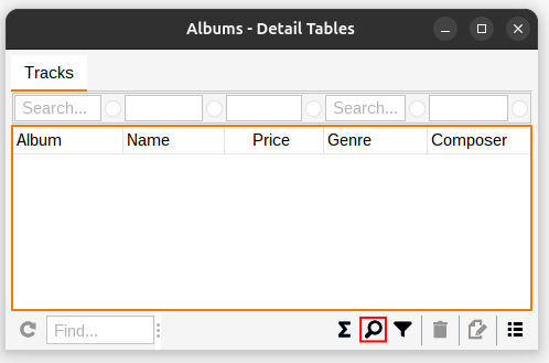
Each table has an associated search panel, which can be displayed by using the button highlighted in the screenshot below. This button toggles through the available search panel views; hidden, simple and advanced.
|
Note
|
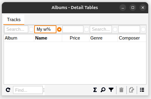
Text based condition fields are by default Case-Insensitive and the EQUAL and NOT EQUAL fields have automatic wildcard prefix and postfixes. The automatic wildcards have been disabled for the demonstration below. These can be configured via the condition field popup dialog. The application remembers the field configuration in user preferences. |
By default, column condition operators are set to EQUAL and foreign keys to IN, to change the operator you can use the Ctrl+UP / DOWN keyboard shortcut (the operator is displayed in a tooltip) or switch to the advanced search panel view, see below.
|
Note
|
On macOS, use ⌘ (Command) instead of Ctrl for keyboard shortcuts. |
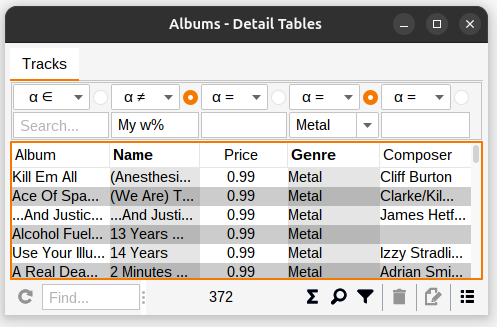
In the screenshot below we have added a wildcard condition to the Name column, using the % character as a wildcard.
|
Note
|
The condition is automatically enabled when a value has been entered. |
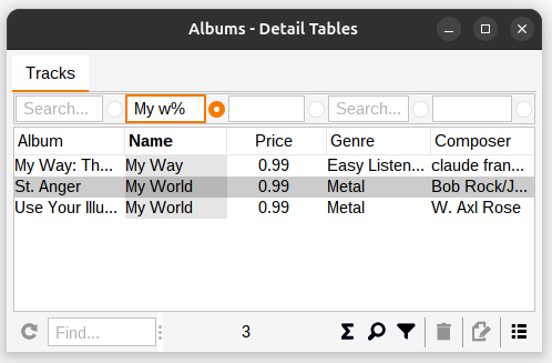
When the search condition has changed, as in, when it does not represent the data currently in the table, the refresh button in the lower left corner becomes enabled, indicating that a refresh is in order. Further conditions can be added before a refresh is performed.
There are multiple ways of refreshing the table data:
-
Pressing the Enter key with the focus somewhere on the condition panel
-
Using the aformentioned refresh button or the F5 keyboard shortcut
-
Using the Refresh action in the table popup menu, or its Alt+R keyboard shortcut
-
Using the Refresh button on the edit panel, if one is available, or its Alt+R keyboard shortcut
After the table has been refreshed, the refresh button becomes disabled, indicating that the table data represents the current search condition.
|
Note
|
You can tell a condition is enabled by its BOLD header and shaded column. |
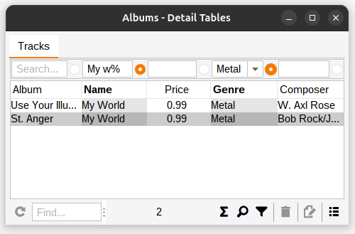
Adding a condition to the Genre column.
With multiple conditions enabled, all of them are included next time the table is refreshed.
Enabling the advanced condition panel view, in order to change the Name condition to NOT EQUAL.
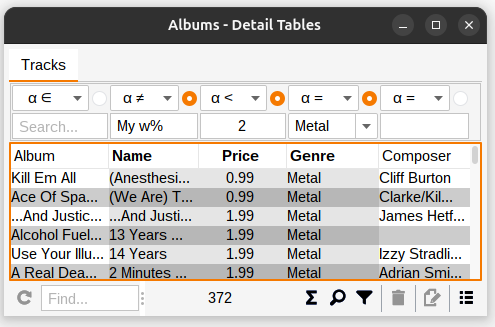
Adding a LESS THAN condition to the Price column.
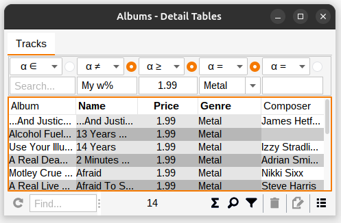
Changing the Price condition to GREATER THAN OR EQUAL.
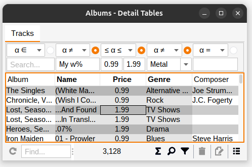
Changing the Price condition to BETWEEN and the Genre condition to NOT EQUAL.
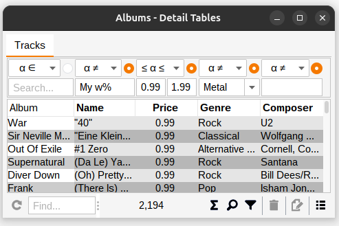
Adding a NOT EQUAL condition to the Composer column with an empty value.
|
Note
|
When searching for empty values, the condition must be manually enabled, since it’s only enabled automatically when a non-empty value is entered. |
|
Note
|
To clear all column conditions use the Search → Clear action in the table popup menu. This clears all values and resets all operators to their defaults EQUAL for columns and IN for foreign keys. |
8. Filtering
While the search panel (Searching) queries the database to retrieve specific records, some applications also provide a filter panel that dynamically filters the records currently loaded in the table - without requiring a database refresh.
8.1. Availability
The filter panel is an optional feature that developers can choose to include. To check if filtering is available:
-
Look for the Funnel icon in the toolbar (located next to the magnifying glass search icon)
-
If the funnel icon is present, the filter panel is available
-
If the funnel icon is not present, the application does not include filtering capability
8.2. Accessing the Filter Panel
To show or hide the filter panel:
-
Click the Funnel icon in the toolbar
-
Or use the Ctrl+Alt+F keyboard shortcut
-
Or press Ctrl+Shift+F to display a dialog for selection a specific filter panel
The filter panel toggles through three states: hidden, simple, and advanced, just like the search panel.
8.3. Using Filters
The filter panel works exactly like the search panel described in Searching. You can:
-
Configure filter conditions using the same operators (EQUAL, NOT EQUAL, BETWEEN, etc.)
-
Use the same keyboard shortcuts (Ctrl+↑/↓ to change operators)
-
Configure the same field settings (case sensitivity, wildcards) via right-click
-
Enable and disable individual column filters
The key difference is that filters apply instantly to the currently visible table data - no refresh is needed. As you type or modify filter conditions, the table updates automatically to show only matching records.
8.4. Understanding Filter Status
When filters are active, the status bar below the table displays both the total number of records and the number of filtered records:
-
No filters active - Shows only the visible record count (e.g., "400")
-
Filters active - Shows visible and filtered record counts (e.g., "400 (200 filtered)")
This makes it easy to see at a glance how many records are being hidden by your current filter conditions.
8.5. Search vs. Filter
Understanding when to use search versus filter:
-
Search panel - Queries the database to retrieve specific records. Use when you want to limit what data is loaded from the database.
-
Filter panel - Filters already-loaded records in the table. Use when you want to quickly narrow down what you’re currently viewing without hitting the database.
You can use both together: search to retrieve a subset of data from the database, then filter to dynamically narrow that subset further.
|
Note
|
To clear all column filters use the Filter → Clear action in the table popup menu. This clears all filter values and resets all operators to their defaults. |
9. Keyboard shortcuts
|
Note
|
On macOS, use ⌘ (Command) instead of Ctrl for all shortcuts listed below. For example, Ctrl+F becomes ⌘+F on macOS. |
| Navigation | |
|---|---|
Ctrl+Alt+↑/↓ |
Navigate up/down |
Ctrl+Alt+←/→ |
Navigate left/right |
| Resizing | |
|---|---|
Shift+Alt+←/→ |
Resize left/right |
Ctrl+Shift+Alt+SHIFT+←/→ |
Expand/collapse |
Ctrl+Alt+E |
Toggle edit panel |
| Transfer focus | |
|---|---|
Ctrl+E |
Edit panel (initial focus component) |
Ctrl+T |
Table |
Ctrl+I |
Input field |
Ctrl+S |
Search field |
Ctrl+F |
Find in table |
| Edit panel | |
|---|---|
Enter |
Transfer focus to the next input field |
Shift+Enter |
Transfer focus to the previous input field |
Alt+A |
Add |
Alt+S |
Save (when available) |
Alt+U |
Update |
Alt+D |
Delete |
Alt+C |
Clear |
Alt+R |
Refresh |
| Table panel | |
|---|---|
Insert |
Add new item |
Ctrl+Insert |
Edit selected item |
Shift+Insert |
Edit selected items |
Del |
Delete selected |
Ctrl+C |
Copy selected rows to clipboard |
Ctrl+Alt+C |
Copy selected cell to clipboard |
Ctrl+Shift+←/→ |
Move selected column |
Ctrl++/− |
Resize selected column |
Ctrl+Shift+↑/↓ |
Move selection |
Ctrl+G |
Show popup menu |
Ctrl+P |
Print (if available) |
Alt+R |
Refresh |
F5 |
Refresh, when condition panel is visible and button is enabled |
Ctrl+Alt+S |
Toggle condition panel between hidden, visible and advanced |
Ctrl+S |
Select condition panel |
Ctrl+Alt+F |
Toggle filter panel between hidden, visible and advanced |
Ctrl+Shift+F |
Select filter panel |
Alt+↑/↓ |
Toggle sorting by selected column |
Shift+Alt+↑/↓ |
Toggle and add sorting by selected column |
| Table condition panel | |
|---|---|
Ctrl+↓/↑ |
Previous/next search operator |
Ctrol+Enter |
Enable/disable column condition |
Ctrol+Shift+Enter |
Clear column condition |
Enter |
Refresh table data |
| Table search field | |
|---|---|
Enter or ↓ |
Find next |
Shift+Enter or ↓ |
Find and select next |
↑ |
Find previous |
Shift+↑ |
Find and select previous |
Esc |
Move focus to table |
| Table export | |
|---|---|
Space |
Toggle attribute inclusion |
| Date/time field | |
|---|---|
Insert |
Display calendar |
↑/↓ |
Increment/decrement based on cursor position |
| Calendar | |
|---|---|
Ctrl+↓/↑ |
Previous/next year |
Shift+↓/↑ |
Previous/next month |
←/→ |
Previous/next day |
↑/↓ |
Previous/next week |
Shift+Alt+↓/↑ |
Previous/next hour |
Ctrl+Alt+↓/↑ |
Previous/next minute |
| Entity field (combo box or search field) with Add and/or Edit controls | |
|---|---|
Insert |
Add new item |
Ctrl+Insert |
Edit selected item |
| Text input panel | |
|---|---|
Insert |
Display multi-line input dialog |
| Viewing dependencies | |
|---|---|
Ctrl+Alt+←/→ |
Navigate left/right |