1. EntityPanel
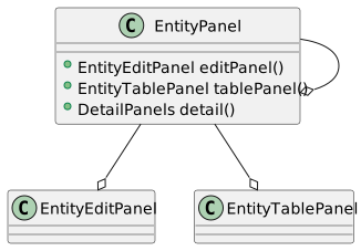
The EntityPanel is the base UI class for working with entity instances. It usually consists of an EntityTablePanel, an EntityEditPanel, and a set of detail panels representing the entities having a master/detail relationship with the underlying entity.
1.1. Basics
You can either extend the EntityPanel class or instantiate one directly, depending on your needs.
public class AddressPanel extends EntityPanel {

  public AddressPanel(SwingEntityModel addressModel) {
    super(addressModel, new AddressEditPanel(addressModel.editModel()));
  }
}
SwingEntityModel addressModel =
new SwingEntityModel(Address.TYPE, connectionProvider);
EntityPanel addressPanel =
new EntityPanel(addressModel,
new AddressEditPanel(addressModel.editModel()));1.2. Detail panels
Adding a detail panel is done with a single method call, but note that the underlying EntityModel must contain the corresponding detail model, see detail models. The detail panel hierarchy typically mirrors the model hierarchy — here the customer panel adds an invoice panel, whose model is the customer model’s detail model:
public final class CustomerPanel extends EntityPanel {

  public CustomerPanel(CustomerModel customerModel) {
    super(customerModel,
            new CustomerEditPanel(customerModel.editModel()),
            new CustomerTablePanel(customerModel.tableModel()));

    detail().add(new InvoicePanel(customerModel.detail().get(Invoice.TYPE)));
  }
}
A detail panel is just an EntityPanel — extended or instantiated directly:
public final class AlbumPanel extends EntityPanel {

  public AlbumPanel(AlbumModel albumModel) {
    super(albumModel,
            new AlbumEditPanel(albumModel.editModel()),
            new AlbumTablePanel(albumModel.tableModel()));
    SwingEntityModel trackModel = albumModel.detail().get(Track.TYPE);
    EntityPanel trackPanel = new EntityPanel(trackModel,
            new TrackEditPanel((TrackEditModel) trackModel.editModel(), trackModel.tableModel().selection()),
            new TrackTablePanel((TrackTableModel) trackModel.tableModel()));

    detail().add(trackPanel);
  }
}
1.2.1. Detail panel layout
By default, detail panels are laid out by a TabbedDetailLayout: the master panel and its detail panels share a split pane, with the detail panels in a tabbed pane on the right. A detail panel can be expanded, collapsed or torn out into a separate window, with both the mouse and the keyboard (see navigation below).
The layout is configurable per panel — the invoice panel below opts out entirely, since its invoice line panel is embedded in the edit panel itself, while still registering the panel for keyboard navigation:
public final class InvoicePanel extends EntityPanel {

  public InvoicePanel(SwingEntityModel invoiceModel) {
    super(invoiceModel,
            new InvoiceEditPanel(invoiceModel.editModel(),
                    invoiceModel.detail().get(InvoiceLine.TYPE)),
            new InvoiceTablePanel(invoiceModel.tableModel()),
            // The InvoiceLine panel is embedded in InvoiceEditPanel,
            // so this panel doesn't need a detail panel layout.
            config -> config.detailLayout(DetailLayout.NONE));
    InvoiceEditPanel editPanel = (InvoiceEditPanel) editPanel();
    // We still add the InvoiceLine panel as a detail panel for keyboard navigation
    detail().add(editPanel.invoiceLinePanel());
  }
}
1.3. Edit panel state
The edit panel can be embedded (the default, above the table), displayed in a separate window, or hidden, toggled via the toolbar or CTRL-ALT-E. The available states — and whether the toggle uses a frame or a dialog — are configurable via the panel’s Config.
1.4. Navigation and resizing
Entity panels form a keyboard-navigable hierarchy: CTRL-ALT-UP/DOWN moves between master and detail panels, CTRL-ALT-LEFT/RIGHT between sibling panels — with focus following, so the active panel is always the one under the keyboard. SHIFT-ALT-LEFT/RIGHT resizes a master/detail split, and CTRL-SHIFT-ALT-LEFT/RIGHT expands or collapses it. Within a panel, CTRL-E transfers focus to the edit panel, CTRL-T to the table, CTRL-I to the initial input field, CTRL-F to the table search field.
The complete, current shortcut reference is available in any running application via the Help menu (Keyboard shortcuts).
2. EntityEditPanel
The EntityEditPanel manages the input components (text fields, combo boxes and such) for editing an entity instance.
When extending an EntityEditPanel you must implement the initializeUI() method, which initializes the edit panel UI. The EntityEditPanel class exposes methods for creating input components and linking them to the underlying EntityEditModel instance.
public class CustomerEditPanel extends EntityEditPanel {

  public CustomerEditPanel(SwingEntityEditModel editModel) {
    super(editModel);
  }

  @Override
  protected void initializeUI() {
    //methods creating an input field also create a label by default,
    //which is accessible via component(Customer.FIRST_NAME).label()
    create().textField(Customer.FIRST_NAME);
    create().textField(Customer.LAST_NAME);
    create().textField(Customer.EMAIL);
    create().checkBox(Customer.ACTIVE);

    setLayout(gridLayout(4, 1));
    //the addInputPanel method creates and adds a panel containing the
    //component associated with the attribute as well as a JLabel with the
    //property caption as defined in the domain model
    addInputPanel(Customer.FIRST_NAME);
    addInputPanel(Customer.LAST_NAME);
    addInputPanel(Customer.EMAIL);
    addInputPanel(Customer.ACTIVE);
  }
}
public class AddressEditPanel extends EntityEditPanel {
public AddressEditPanel(SwingEntityEditModel editModel) {
super(editModel);
}
@Override
protected void initializeUI() {
create().textField(Address.STREET)
.columns(25);
create().textField(Address.CITY)
.columns(25);
create().checkBox(Address.VALID);
setLayout(gridLayout(3, 1));
addInputPanel(Address.STREET);
addInputPanel(Address.CITY);
addInputPanel(Address.VALID);
}
}public class CustomerAddressEditPanel extends EntityEditPanel {
public CustomerAddressEditPanel(SwingEntityEditModel editModel) {
super(editModel);
}
@Override
protected void initializeUI() {
create().comboBoxPanel(CustomerAddress.ADDRESS_FK, this::createAddressEditPanel)
.preferredWidth(280)
.includeAddButton(true);
setLayout(borderLayout());
addInputPanel(CustomerAddress.ADDRESS_FK);
}
private AddressEditPanel createAddressEditPanel() {
return new AddressEditPanel(new SwingEntityEditModel(Address.TYPE, editModel().connectionProvider()));
}
}2.1. Detailed example
Here’s how a text field is created and added to the edit panel.
create().textField(Customer.FIRST_NAME)
        .columns(12);

setLayout(gridLayout(1, 1));
addInputPanel(Customer.FIRST_NAME);
And here’s the equivilent code, showing what’s going on behind the scenes.
ColumnDefinition<String> firstNameDefinition =
        editModel().entityDefinition().columns().definition(Customer.FIRST_NAME);

//create the text field
JTextField firstNameField = new JTextField();
firstNameField.setColumns(12);
firstNameDefinition.description()
        .ifPresent(firstNameField::setToolTipText);
//associate the text field with the first name attribute
component(Customer.FIRST_NAME).set(firstNameField);

//wrap the text field in a ComponentValue
ComponentValue<JTextField, String> firstNameFieldValue =
        new AbstractTextComponentValue<JTextField, String>(firstNameField) {
          @Override
          protected String getComponentValue() {
            return component().getText();
          }

          @Override
          protected void setComponentValue(String text) {
            component().setText(text);
          }
        };

//link the component value to the attribute value in the editor
firstNameFieldValue.link(editor().value(Customer.FIRST_NAME));

//create the first name label
JLabel firstNameLabel = new JLabel(firstNameDefinition.caption());
//associate the label with the text field
firstNameLabel.setLabelFor(firstNameField);

//create an input panel, with the label and text field
JPanel firstNamePanel = new JPanel(borderLayout());
firstNamePanel.add(firstNameLabel, BorderLayout.NORTH);
firstNamePanel.add(firstNameField, BorderLayout.CENTER);

setLayout(gridLayout(1, 1));
add(firstNamePanel);
2.2. Input controls
2.2.1. Boolean
JCheckBox checkBox = create()
        .checkBox(Demo.BOOLEAN)
        .build();

NullableCheckBox nullableCheckBox = create()
        .nullableCheckBox(Demo.BOOLEAN_NULLABLE)
        .build();

JComboBox<Item<Boolean>> comboBox = create()
        .booleanComboBox(Demo.BOOLEAN_NULLABLE)
        .build();
2.2.2. Foreign key
EntityComboBox comboBox = create()
        .comboBox(Demo.FOREIGN_KEY)
        .build();

// Include add/edit buttons
EntityComboBoxPanel comboBoxPanel = create()
        .comboBoxPanel(Demo.FOREIGN_KEY, this::createEditPanel)
        .includeAddButton(true)
        .includeEditButton(true)
        .build();

EntitySearchField searchField = create()
        .searchField(Demo.FOREIGN_KEY)
        .build();

// Include add/edit buttons
EntitySearchFieldPanel searchFieldPanel = create()
        .searchFieldPanel(Demo.FOREIGN_KEY, this::createEditPanel)
        .includeAddButton(true)
        .includeEditButton(true)
        .build();

//readOnly
JTextField textField = create()
        .textField(Demo.FOREIGN_KEY)
        .build();
2.2.3. Temporal
TemporalField<LocalDateTime> textField =
        (TemporalField<LocalDateTime>) create()
                .textField(Demo.LOCAL_DATE)
                .build();

TemporalField<LocalDate> localDateField = create()
        .temporalField(Demo.LOCAL_DATE)
        .build();

TemporalFieldPanel<LocalDate> temporalPanel = create()
        .temporalFieldPanel(Demo.LOCAL_DATE)
                .build();
2.2.4. Numerical
NumberField<Integer> integerField =
        (NumberField<Integer>) create()
                .textField(Demo.INTEGER)
                .build();

integerField = create()
        .integerField(Demo.INTEGER)
        .build();

NumberField<Long> longField =
        (NumberField<Long>) create()
                .textField(Demo.LONG)
                .build();

longField =
        create()
                .longField(Demo.LONG)
                .build();

NumberField<Double> doubleField =
        (NumberField<Double>) create()
                .textField(Demo.DOUBLE)
                .build();

doubleField = create()
        .doubleField(Demo.DOUBLE)
        .build();

NumberField<BigDecimal> bigDecimalField =
        (NumberField<BigDecimal>) create()
                .textField(Demo.BIG_DECIMAL)
                .build();

bigDecimalField = create()
        .bigDecimalField(Demo.BIG_DECIMAL)
        .build();

NumberField<BigInteger> bigIntegerField =
        (NumberField<BigInteger>) create()
                .textField(Demo.BIG_DECIMAL)
                .build();

bigIntegerField = create()
        .bigIntegerField(Demo.BIG_INTEGER)
        .build();
2.2.5. Text
JTextField textField = create()
        .textField(Demo.TEXT)
        .build();

JFormattedTextField maskedField = create()
        .maskedTextField(Demo.FORMATTED_TEXT)
        .mask("###:###")
        .valueContainsLiteralCharacters(true)
        .build();

JTextArea textArea = create()
        .textArea(Demo.LONG_TEXT)
        .rowsColumns(5, 20)
        .build();

TextFieldPanel inputPanel = create()
        .textFieldPanel(Demo.LONG_TEXT)
        .build();
2.2.6. Selection
DefaultComboBoxModel<String> comboBoxModel =
        new DefaultComboBoxModel<>(new String[] {"One", "Two"});

JComboBox<String> comboBox = create()
        .comboBox(Demo.TEXT, comboBoxModel)
        .editable(true)
.build();2.3. Panels & labels
JLabel label = create()
        .label(Demo.TEXT)
        .build();

JPanel inputPanel = create()
        .inputPanel(Demo.TEXT)
        .label(new JLabel("Label"))
        .build();
2.4. Advanced Patterns
2.4.1. Configuration Options
EntityEditPanel supports configuration via a lambda in the constructor:
    class InvoiceEditPanel extends EntityEditPanel {
      public InvoiceEditPanel(SwingEntityEditModel editModel) {
        super(editModel, config ->
                // Keep displaying newly inserted invoice since we'll continue
                // working with it by adding invoice lines
                config.clearAfterInsert(false));
      }

      @Override
      protected void initializeUI() {
        // UI setup
      }
    }
2.4.2. Focus Management
Configure the focus behaviour:
    class CustomerEditPanel extends EntityEditPanel {
      public CustomerEditPanel(SwingEntityEditModel editModel) {
        super(editModel);
      }

      @Override
      protected void initializeUI() {
        focus().initial().set(Customer.FIRSTNAME);
        focus().afterInsert().set(Customer.ADDRESS);

        // Create your input components...
      }
    }
2.4.3. Inline Edit Panels with ComboBoxPanel
Create combo boxes with inline add/edit capabilities:
    class TrackEditPanel extends EntityEditPanel {
      public TrackEditPanel(SwingEntityEditModel editModel) {
        super(editModel);
      }

      @Override
      protected void initializeUI() {
        create().comboBoxPanel(Track.MEDIATYPE_FK, this::createMediaTypeEditPanel)
                .preferredWidth(160)
                .includeAddButton(true)
                .includeEditButton(true);

        create().searchFieldPanel(Track.MEDIATYPE_FK, this::createMediaTypeEditPanel)
                .preferredWidth(160)
                .includeAddButton(true)
                .includeEditButton(true);
      }

      private EntityEditPanel createMediaTypeEditPanel() {
        return new MediaTypeEditPanel(new SwingEntityEditModel(MediaType.TYPE, editModel().connectionProvider()));
      }
    }
2.4.4. Custom Component Integration
Using custom components:
    class TrackEditPanel extends EntityEditPanel {
      public TrackEditPanel(SwingEntityEditModel editModel) {
        super(editModel);
      }

      @Override
      protected void initializeUI() {
        // Create a custom component and set it as the attribute
        // component, it is automatically linked to the editor value
        component(Track.MILLISECONDS).set(new DurationComponentValue());
      }
    }
2.4.5. Keyboard Shortcuts and Actions
Add custom keyboard shortcuts for enhanced productivity:
    class CustomerEditPanel extends EntityEditPanel {
      public CustomerEditPanel(SwingEntityEditModel editModel) {
        super(editModel);
      }

      @Override
      protected void initializeUI() {
        create().textField(Customer.STATE)
                .keyEvent(KeyEvents.builder()
                        .keyCode(VK_SPACE)
                        .modifiers(MENU_SHORTCUT_MASK)
                        .action(Control.action(this::selectStateFromExistingValues)));
      }

      private void selectStateFromExistingValues(ActionEvent event) {
        JTextField stateField = (JTextField) event.getSource();

        Dialogs.select()
                .list(editModel().connection().select(Customer.STATE))
                .owner(stateField)
                .select()
                .single()
                .ifPresent(stateField::setText);
      }
    }
2.4.6. Detail Panel Integration
EntityEditPanel can include detail panels for master-detail relationships:
    class InvoiceEditPanel extends EntityEditPanel {
      private final EntityPanel invoiceLinePanel;

      public InvoiceEditPanel(SwingEntityEditModel editModel, SwingEntityModel invoiceLineModel) {
        super(editModel, config -> config.clearAfterInsert(false));
        this.invoiceLinePanel = createInvoiceLinePanel(invoiceLineModel);
      }

      @Override
      protected void initializeUI() {
        // Initialize main edit controls...

        // Add detail panel
        add(invoiceLinePanel, BorderLayout.SOUTH);
      }

      private EntityPanel createInvoiceLinePanel(SwingEntityModel invoiceLineModel) {
        // Create and return invoice line panel
        return new EntityPanel(invoiceLineModel);
      }
}2.6. Query Inspector
An Editor Inspector can be enabled globally via the EntityEditPanel.Config.INCLUDE_INSPECTOR configuration value or for a single panel via the panel configuration.
The inspector displays the editor state — values, modified/valid flags, validation messages — along with the INSERT and UPDATE queries the current state would produce, dynamically updated. See Development tools.
EntityEditPanel.Config.INCLUDE_INSPECTOR.set(true);The inspector can be opened using the CTRL-ALT-R keyboard shortcut, when the edit panel is focused.
3. EntityTablePanel
The EntityTablePanel provides a table view of entities: a searchable, filterable, sortable grid with a toolbar, a popup menu, in-table editing, a summary panel and a status bar — all driven by an underlying EntityTableModel.
3.1. Configuration
Each panel is configured via a Config instance, supplied to the constructor. Most configuration values also exist as system properties, configuring the default for all table panels in an application — Config.INCLUDE_FILTERS, Config.INCLUDE_EXPORT and company — with the per-panel configuration overriding the default.
public InvoiceTablePanel(SwingEntityTableModel tableModel) {
  super(tableModel, config -> config
          // The TOTAL column is updated automatically when invoice lines are updated,
          // see InvoiceLineEditModel, so we don't want it to be editable via the popup menu.
          .editable(attributes -> attributes.remove(Invoice.TOTAL))
          // The factory providing our custom condition panel.
          .conditionPanel(new InvoiceConditionPanelFactory(tableModel))
          // Start with the SIMPLE condition panel view.
          .conditionView(SIMPLE));
}
3.2. Editing
The table supports editing the selected rows directly, in two ways:
-
Edit value — the Edit popup menu (and SHIFT-INSERT) edits a single attribute for all selected rows, in a dialog. Which attributes are editable this way is controlled via Config.editable(), and Config.editComponent() provides a custom input component for a given attribute.
-
In-cell editing — standard table cell editing, using components provided by Config.cellEditor().
The track panel below configures both, along with custom cell renderers, and starts cell editing on INSERT rather than on typing:
public TrackTablePanel(TrackTableModel tableModel) {
  super(tableModel, config -> config
          // Custom component for editing track ratings
          .editComponent(Track.RATING, new RatingEditComponent())
          // Custom component for editing track durations
          .editComponent(Track.MILLISECONDS, new DurationEditComponent())
          // Custom cell renderer for ratings
          .cellRenderer(Track.RATING, TrackTablePanel::ratingRenderer)
          // Custom cell renderer for track duration (min:sec)
          .cellRenderer(Track.MILLISECONDS, TrackTablePanel::durationRenderer)
          // Custom cell editor for track ratings
          .cellEditor(Track.RATING, ratingEditor(tableModel.entityDefinition()))
          // Custom cell editor for track durations (min:sec:ms)
          .cellEditor(Track.MILLISECONDS, durationEditor())
          // Start editing when the INSERT key is pressed
          .table(table -> table
                  .autoStartsEdit(false)
                  .startEditing(keyStroke(VK_INSERT)))
          .includeLimitMenu(true));
A custom edit component for a foreign key, here a track selector used when editing the track of the selected invoice lines:
.editComponent(InvoiceLine.TRACK_FK, new TrackEditComponent(InvoiceLine.TRACK_FK)));3.3. Custom controls
The panel’s controls — refresh, add, edit, delete, print and the rest — are identified by ControlKeys. Overriding setupControls() is the idiomatic place to assign custom controls to standard keys; a control assigned to a standard key appears wherever that key is used — popup menu, toolbar, keyboard shortcut.
@Override
protected void setupControls() {
  // Assign a custom report action to the standard PRINT control,
  // which is then made available in the popup menu and on the toolbar
  control(PRINT).set(Control.builder()
          .command(this::viewCustomerReport)
          .caption(BUNDLE.getString("customer_report"))
          .icon(FrameworkIcons.instance().print())
          .enabled(tableModel().selection().empty().not())
          .build());
}
The popup menu layout itself is configurable via configurePopupMenu() — here a custom control is placed at the top, above the default menu:
  // Add a custom control to the top of the table popup menu.
  // Start by clearing the popup menu layout
  configurePopupMenu(layout -> layout.clear()
          // add our custom control
          .control(Control.builder()
                  .command(this::raisePriceOfSelected)
                  .caption(BUNDLE.getString("raise_price") + "...")
                  .enabled(tableModel().selection().empty().not()))
          // and a separator
          .separator()
          // and add all the default controls
          .defaults());
}
3.3.1. Adding a print action
The most common custom control is an action for printing reports or acting on the selected rows. For the simplest case, where a single print action is required, a custom control can be associated with the PRINT ControlKey, appearing in the Print submenu in the table popup menu as well as on the table toolbar. For more complex cases, where multiple print controls are required, custom controls can be associated with the PRINT_CONTROLS ControlKey.
public class CustomerTablePanel extends EntityTablePanel {

  public CustomerTablePanel(SwingEntityTableModel tableModel) {
    super(tableModel);
    // associate a custom Control with the PRINT control key,
    // which calls the viewCustomerReport method in this class,
    // enabled only when the selection is not empty
    control(PRINT).set(Control.builder()
            .command(this::viewCustomerReport)
            .caption("Customer report")
            .icon(FrameworkIcons.instance().print())
            .enabled(tableModel().selection().empty().not())
            .build());
  }

  private void viewCustomerReport() {
    List<Entity> selectedCustomers = tableModel().selection().items().get();
    if (selectedCustomers.isEmpty()) {
      return;
    }

    Collection<String> customerIds = Entity.values(Customer.ID, selectedCustomers);
    Map<String, Object> reportParameters = new HashMap<>();
    reportParameters.put("CUSTOMER_IDS", customerIds);

    JasperPrint customerReport = tableModel().connection()
            .report(Customer.REPORT, reportParameters);

    Dialogs.builder()
            .component(new JRViewer(customerReport))
            .owner(this)
            .modal(false)
            .title("Customer Report")
            .size(new Dimension(800, 600))
            .show();
  }
}
3.4. Condition and filter panels
The panel above the table provides query conditions — what is fetched from the database — while filters narrow down what is shown, without a round trip. The condition panel has three views: HIDDEN, SIMPLE (a single row of fields) and ADVANCED (operators and bounds per column), toggled via the toolbar or CTRL-ALT-S, with CTRL-S moving focus to a condition field. The initial view and a custom condition panel implementation are configurable — see the conditionPanel() and conditionView() calls in the invoice panel configuration above, where a custom condition panel provides invoice-specific search fields.
Filter panels are excluded by default and included via Config.INCLUDE_FILTERS (globally) or includeFilters() (per panel).
3.5. Exporting data
A configurable denormalized data export tool — including attributes of referenced entities via foreign key traversal — can be included in the EntityTablePanel Copy table popup submenu, via the EntityTablePanel.Config.INCLUDE_EXPORT configuration value or the panel configuration. See Exporting data.
3.6. Query Inspector
A Query Inspector can be enabled globally via the EntityTablePanel.Config.INCLUDE_INSPECTOR configuration value or for a single panel via the panel configuration.
The Query Inspector displays the SELECT query, dynamically updated according to the underlying query conditions.
EntityTablePanel.Config.INCLUDE_INSPECTOR.set(true);The Query Inspector can be opened using the CTRL-ALT-Q keyboard shortcut, when the table panel is focused.
3.7. Keyboard shortcuts
Each ControlKey carries its default keystroke — INSERT adds a new row, CTRL-INSERT edits the selected row, SHIFT-INSERT edits a single value for the selection, DELETE deletes the selection. A default keystroke can be modified before the panels are created, typically during application startup — here a CTRL modifier is added to the DELETE shortcut, application-wide:
// Add a CTRL modifier to the DELETE key shortcut for table panels
EntityTablePanel.ControlKeys.DELETE.defaultKeystroke().update(keyStroke ->
        keyStroke(keyStroke.getKeyCode(), MENU_SHORTCUT_MASK));
4. Exporting data
The table export tool produces denormalized, tab-separated output from the rows of an EntityTablePanel — to the clipboard or to a file — and is available in the table popup menu’s Export… submenu.
What sets it apart from a plain copy is foreign key traversal: the export dialog presents the entity’s attributes as a tree, where each foreign key expands into the attributes of the referenced entity, recursively. Including Track → Album → Artist → Name exports the artist name as a column alongside the track’s own attributes — denormalized flat output from normalized data, without writing a query.
4.1. Using it
-
The attribute tree is navigated with the keyboard; SPACE toggles whether an attribute is included.
-
Foreign key nodes expand on demand, so cyclic references are a non-issue — expansion goes as deep as you take it.
-
The export covers the selected rows or all rows.
-
Output goes to the clipboard or a .tsv file, ready for a spreadsheet.
4.2. Configurations
An export configuration — the included attributes, their order and the target — can be named, saved and opened later, and reappears in the export dialog as long as the configuration file exists. The active configuration is saved in user preferences on application exit, so a routinely used export is a two-keystroke affair.
4.3. Enabling
The export tool is excluded by default, and enabled globally via the EntityTablePanel.Config.INCLUDE_EXPORT configuration value or per panel:
EntityTablePanel.Config.INCLUDE_EXPORT.set(true);The underlying model, EntityExport, is UI-independent and can be used to produce the same output programmatically.
5. EntityPanel.Builder
Use the EntityPanel.Builder class to specify a EntityPanel class configuration, for panels that should not be initialized until used, such the lookup table panels.
  private static List<EntityPanel.Builder> createLookupPanelBuilders() {
    EntityPanel.Builder addressPanelBuilder = EntityPanel.builder()
            .entityType(Address.TYPE)
            .panel(connectionProvider -> {
              SwingEntityModel addressModel =
                      new SwingEntityModel(Address.TYPE, connectionProvider);

              return new EntityPanel(addressModel,
                      new AddressEditPanel(addressModel.editModel()));
            });

    return List.of(addressPanelBuilder);
  }
6. EntityApplicationPanel
The EntityApplicationPanel class serves as the main application UI. When extending this class you must provide a constructor with a single application model parameter, as seen below.
The constructor takes the application’s root entity panels, and optionally a set of lookup panel builders: panels for supporting entities — lookup and reference data — which appear in the application’s View menu and open on demand, in their own windows, rather than occupying a tab.
public class StoreApplicationPanel extends EntityApplicationPanel<StoreApplicationModel> {

  public StoreApplicationPanel(StoreApplicationModel applicationModel) {
    super(applicationModel, createPanels(applicationModel), createLookupPanelBuilders());
  }

  private static List<EntityPanel> createPanels(StoreApplicationModel applicationModel) {
    CustomerModel customerModel = (CustomerModel)
            applicationModel.models().get(Customer.TYPE);
    CustomerAddressModel customerAddressModel = (CustomerAddressModel)
            customerModel.detail().get(CustomerAddress.TYPE);

    EntityPanel customerPanel = new EntityPanel(customerModel,
            new CustomerEditPanel(customerModel.editModel()),
            new CustomerTablePanel(customerModel.tableModel()));
    EntityPanel customerAddressPanel = new EntityPanel(customerAddressModel,
            new CustomerAddressEditPanel(customerAddressModel.editModel()));

    customerPanel.detail().add(customerAddressPanel);

    return List.of(customerPanel);
  }

  private static List<EntityPanel.Builder> createLookupPanelBuilders() {
    EntityPanel.Builder addressPanelBuilder = EntityPanel.builder()
            .entityType(Address.TYPE)
            .panel(connectionProvider -> {
              SwingEntityModel addressModel =
                      new SwingEntityModel(Address.TYPE, connectionProvider);

              return new EntityPanel(addressModel,
                      new AddressEditPanel(addressModel.editModel()));
            });

    return List.of(addressPanelBuilder);
  }

  public static void main(String[] args) {
    Locale.setDefault(new Locale("en", "EN"));
    EntityPanel.Config.TOOLBAR_CONTROLS.set(true);
    ReferentialIntegrityErrorHandling.REFERENTIAL_INTEGRITY_ERROR_HANDLING
            .set(ReferentialIntegrityErrorHandling.DISPLAY_DEPENDENCIES);
    EntityApplication.builder(StoreApplicationModel.class, StoreApplicationPanel.class)
            .domain(Store.DOMAIN)
            .defaultUser(User.parse("scott:tiger"))
            .start();
  }
}
6.1. Starting the application
An application is assembled and started with the EntityApplication builder, which handles the startup sequence: look and feel, login (unless a user is provided), connection, application model and panel construction, and the main frame. The main method is also the natural place to configure framework defaults — configuration values apply to every panel created after them. The Chinook demo exercises a good portion of the configuration surface:
public static void main(String[] args) throws CancelException {
  String language = UserPreferences.get(LANGUAGE_PREFERENCES_KEY, Locale.getDefault().getLanguage());
  Locale.setDefault(LANGUAGE_IS.equals(language) ? LOCALE_IS : LOCALE_EN);
  UIManager.put("PasswordField.showRevealButton", true);
  FrameworkIcons icons = FrameworkIcons.instance();
  icons.put("plus", ChinookAppPanel.class.getResource("plus.svg"));
  icons.put("minus", ChinookAppPanel.class.getResource("minus.svg"));
  icons.put("graph-pie", ChinookAppPanel.class.getResource("graph-pie.svg"));
  Completion.COMPLETION_MODE.set(Completion.Mode.AUTOCOMPLETE);
  EntityApplicationPanel.CACHE_ENTITY_PANELS.set(true);
  EntityApplicationPanel.SQL_TRACING.set(true);
  EntityPanel.Config.TOOLBAR_CONTROLS.set(true);
  EntityPanel.Config.WINDOW_TYPE.set(WindowType.FRAME);
  EntityEditPanel.Config.MODIFIED_WARNING.set(true);
  EntityEditPanel.Config.INCLUDE_INSPECTOR.set(true);
  // Add a CTRL modifier to the DELETE key shortcut for table panels
  EntityTablePanel.ControlKeys.DELETE.defaultKeystroke().update(keyStroke ->
          keyStroke(keyStroke.getKeyCode(), MENU_SHORTCUT_MASK));
  EntityTablePanel.Config.COLUMN_SELECTION.set(SelectionMode.MENU);
  EntityTablePanel.Config.AUTO_RESIZE_MODE_SELECTION.set(SelectionMode.MENU);
  EntityTablePanel.Config.INCLUDE_FILTERS.set(true);
  EntityTablePanel.Config.INCLUDE_INSPECTOR.set(true);
  EntityTablePanel.Config.INCLUDE_EXPORT.set(true);
  FilterTable.AUTO_RESIZE_MODE.set(JTable.AUTO_RESIZE_ALL_COLUMNS);
  FilterTable.ROWS_FILL_VIEWPORT.set(true);
  FilterTable.STOP_EDIT_ON_FOCUS_LOST.set(false);
  FilterTableCellRenderer.NUMERICAL_HORIZONTAL_ALIGNMENT.set(SwingConstants.CENTER);
  FilterTableCellRenderer.TEMPORAL_HORIZONTAL_ALIGNMENT.set(SwingConstants.CENTER);
  FilterTableHeaderRenderer.FOCUSED_COLUMN_INDICATOR.set(true);
  ValidIndicator.INDICATOR_CLASS.set("is.codion.plugin.flatlaf.indicator.FlatLafValidIndicator");
  CalendarPanel.WEEK_NUMBERS.set(true);
  ReferentialIntegrityErrorHandling.REFERENTIAL_INTEGRITY_ERROR_HANDLING
          .set(ReferentialIntegrityErrorHandling.DISPLAY_DEPENDENCIES);
  EntityApplication.builder(ChinookAppModel.class, ChinookAppPanel.class)
          .domain(Chinook.DOMAIN)
          .version(ChinookAppModel.VERSION)
          .defaultLookAndFeel(MaterialTheme.class)
          .defaultUser(User.parse("scott:tiger"))
          .start();
}
6.2. Layout
The root entity panels are laid out by an ApplicationLayout — by default a TabbedApplicationLayout, one tab per root panel, initialized lazily as they are first displayed. Supply a custom layout via the EntityApplicationPanel constructor to arrange the root panels differently.
6.3. SQL Tracing
|
Note
|
SQL Tracing is only available when using a local EntityConnection. |
Application SQL Tracing can be enabled via the EntityApplicationPanel.SQL_TRACING configuration value.
This configures the underlying EntityConnection to trace its queries and adds a SQL Trace item under Help → Log main menu, with actions to enable tracing and view the trace log.
Disabling SQL Tracing clears the trace log.
EntityApplicationPanel.SQL_TRACING.set(true);7. EntitySearchField
The EntitySearchField is a powerful UI component for entity selection through text-based searching.
It extends HintTextField and provides a search interface that triggers on ENTER key, displaying results based on the configured search criteria.
7.1. Overview
EntitySearchField provides:
-
Text-based entity searching with automatic result handling
-
Single or multi-entity selection
-
Customizable result selection UI (list, table, or custom)
-
Optional add/edit functionality for creating or modifying entities
-
Search progress indication (wait cursor or progress bar)
-
Automatic search on focus loss (optional)
-
Keyboard shortcuts for add/edit operations
7.2. Basic Usage
    EntitySearchModel searchModel = EntitySearchModel.builder()
            .entityType(Customer.TYPE)
            .connectionProvider(connectionProvider)
            .search(Customer.FIRSTNAME, Customer.EMAIL)
            .build();

    EntitySearchField searchField = EntitySearchField.builder()
            .model(searchModel)
            .multiSelection()
            .columns(20)
            .build();
7.3. Search Behavior
The search field operates as follows:
-
User types search text and presses ENTER
-
If the search returns:
-
No results: A message dialog is shown
-
Single result: That entity is automatically selected
-
Multiple results: A selection dialog appears
-
7.4. Customization Options
7.4.1. Custom Selectors
The default selector uses a list for result selection. You can provide custom selectors:
EntitySearchField searchField = EntitySearchField.builder()
.model(searchModel)
.multiSelection()
.selector(new CustomerSelector())
.build();7.4.2. Add and Edit Controls
Enable inline entity creation and editing:
SwingEntityEditModel editModel = new SwingEntityEditModel(Customer.TYPE, connectionProvider);
EntitySearchField searchField = EntitySearchField.builder()
.model(searchModel)
.singleSelection()
.editPanel(() -> new CustomerEditPanel(editModel))
.confirmAdd(true) // Confirm before adding
.confirmEdit(true) // Confirm before editing
.build();
// Access controls
searchField.addControl(); // INSERT key by default
searchField.editControl(); // CTRL+INSERT by default7.4.3. Search Indicators
Configure how search progress is displayed:
EntitySearchField searchField = EntitySearchField.builder()
.model(searchModel)
.multiSelection()
.searchIndicator(SearchIndicator.PROGRESS_BAR)
.build();7.4.4. Field Configuration
EntitySearchField searchField = EntitySearchField.builder()
.model(searchModel)
.singleSelection()
.columns(20) // Field width
.upperCase(true) // Force uppercase
.searchHintEnabled(true) // Show "Search..." hint
.searchOnFocusLost(true) // Auto-search when focus lost
.selectionToolTip(true) // Show selection as tooltip
.editable(false) // Make read-only
.formatter(entity -> // Custom display text
entity.get(Customer.LASTNAME) + " - " + entity.get(Customer.CITY))
.separator(" | ") // Multi-selection separator
.build();7.5. Search Control
You can trigger searches programmatically:
    EntitySearchField searchField = EntitySearchField.builder()
            .model(searchModel)
            .multiSelection()
            .build();
// Get search control
Control searchControl = searchField.searchControl();
// Use in toolbar or menu
Controls.builder()
.control(searchControl)
.build();7.6. Advanced Features
7.6.1. Component Value Integration
A EntitySearchField based ComponentValue can be created via buildValue():
    SwingEntityEditModel editModel = new SwingEntityEditModel(Invoice.TYPE, connectionProvider);

    ComponentValue<EntitySearchField, Entity> searchFieldValue =
            EntitySearchField.builder()
                    .model(searchModel)
                    .singleSelection()
                    .buildValue();

    EntitySearchField searchField = searchFieldValue.component();
    // React to selection changes
    searchField.model().selection().entities().addConsumer(selectedEntities ->
            System.out.println("Selected: " + selectedEntities));

    // Link to edit model
    editModel.editor().value(Invoice.CUSTOMER_FK).link(searchFieldValue);
7.6.2. Custom Edit Component
Use custom search fields in edit panels:
final class TrackEditComponent extends DefaultEditComponent<EntitySearchField, Entity> {

  TrackEditComponent(ForeignKey trackForeignKey) {
    super(trackForeignKey);
  }

  @Override
  protected SingleSelectionBuilder searchField(ForeignKey foreignKey, SwingEntityEditor editor) {
    return super.searchField(foreignKey, editor)
            .selector(new TrackSelector());
  }
} .editComponent(InvoiceLine.TRACK_FK, new TrackEditComponent(InvoiceLine.TRACK_FK)));7.7. Configuration Properties
| Property | Default | Description |
|---|---|---|
|
WAIT_CURSOR |
How to indicate ongoing searches (WAIT_CURSOR or PROGRESS_BAR) |
7.8. Best Practices
-
Provide Clear Search Columns: Configure the search model with appropriate searchable columns
-
Consider Performance: Use result limits in the search model for large datasets
-
Keyboard Support: Leverage the built-in keyboard shortcuts (INSERT for add, CTRL+INSERT for edit)
-
Custom Selectors: Create custom selectors for complex selection scenarios
8. Reporting with JasperReports
Codion uses a plugin oriented approach to report viewing and provides an implementation for JasperReports.
With the Codion JasperReports plugin you can either design your report based on an SQL query in which case you use the JRReport class, which facilitates the report being filled using the active database connection, or you can design your report around the JRDataSource implementation provided by the JasperReportsDataSource class, which is constructed around an iterator.
8.1. JDBC Reports
Using a report based on an SQL query is the simplest way of viewing a report using Codion, just add a method similar to the one below to a EntityTablePanel subclass. You can then create an action calling that method and put it in for example the table popup menu as described in the adding a print action section.
public class CustomerTablePanel extends EntityTablePanel {

  public CustomerTablePanel(SwingEntityTableModel tableModel) {
    super(tableModel);
    // associate a custom Control with the PRINT control key,
    // which calls the viewCustomerReport method in this class,
    // enabled only when the selection is not empty
    control(PRINT).set(Control.builder()
            .command(this::viewCustomerReport)
            .caption("Customer report")
            .icon(FrameworkIcons.instance().print())
            .enabled(tableModel().selection().empty().not())
            .build());
  }

  private void viewCustomerReport() {
    List<Entity> selectedCustomers = tableModel().selection().items().get();
    if (selectedCustomers.isEmpty()) {
      return;
    }

    Collection<String> customerIds = Entity.values(Customer.ID, selectedCustomers);
    Map<String, Object> reportParameters = new HashMap<>();
    reportParameters.put("CUSTOMER_IDS", customerIds);

    JasperPrint customerReport = tableModel().connection()
            .report(Customer.REPORT, reportParameters);

    Dialogs.builder()
            .component(new JRViewer(customerReport))
            .owner(this)
            .modal(false)
            .title("Customer Report")
            .size(new Dimension(800, 600))
            .show();
  }
}
8.2. Export
A report fills to a JasperPrint by default, which the receiver needs JasperReports on its classpath to read. Wrapping the report in an export via JasperReports.export() changes what filling it produces, a PDF for example, in which case nothing of JasperReports reaches the receiver.
The export runs wherever the report is filled, which for a remote connection is on the server, so only the exported document crosses the wire. This is what makes reports available to a client which can not host the reporting engine, an Android or a web client for example.
The export is bound where the report is registered, so the report type carries the result type and the caller need not ask for a format:
// Fills to a JasperPrint, which the receiver needs JasperReports to read
ReportType<Map<String, Object>, JasperPrint> REPORT =
        reportType("customer_report");

// Fills to a PDF, which the receiver needs nothing at all to read
ReportType<Map<String, Object>, byte[]> PDF_REPORT =
reportType("customer_pdf_report");JRReport<JasperPrint> customerReport =
classPathReport(Reports.class, "customer_report.jasper");
add(Customer.REPORT, customerReport);
// The export runs where the report is filled, on the server for a remote
// connection, so only the PDF crosses the wire. Both report types share
// the one loaded report and its cache
add(Customer.PDF_REPORT, export(customerReport, PDF));JasperPrint print = connection.report(Customer.REPORT, reportParameters);
byte[] pdf = connection.report(Customer.PDF_REPORT, reportParameters);JRExport provides PRINT, PDF and XML, any other JasperReports exporter being a lambda.
|
Note
|
JRExport.PDF requires the net.sf.jasperreports:jasperreports-pdf artifact, which is not a dependency of the plugin.
It registers itself through a jasperreports_extension.properties resource scanned off the classpath, so nothing requires its module, and it is neither resolved on the module path nor included in a jlink image unless named explicitly, via --add-modules net.sf.jasperreports.pdf.
|
8.3. JRDataSource Reports
The JRDataSource implementation provided by the JasperReportsDataSource simply iterates through the iterator received via the constructor and retrieves the field values from the underlying entities. The easiest way to make this work is to design the report using field names that correspond to the attribute names, so using the Store domain example from above the fields in a report showing the available items would have to be named 'name', 'active', 'category_code' etc.
EntityConnection connection = connectionProvider.connection();

EntityDefinition customerDefinition =
        connection.entities().definition(Customer.TYPE);

Iterator<Entity> customerIterator =
        connection.select(all(Customer.TYPE)).iterator();

JasperReportsDataSource<Entity> dataSource =
        new JasperReportsDataSource<>(customerIterator,
                (entity, reportField) ->
                        entity.get(customerDefinition.attributes().getOrThrow(reportField.getName())));

JRReport<JasperPrint> customerReport = fileReport("reports/customer.jasper");

JasperPrint jasperPrint = JasperReports.fillReport(customerReport, dataSource);9. Keyboard shortcuts
Codion applications are keyboard-first: every panel, control and navigation action is reachable without the mouse, and every shortcut is discoverable and configurable. The complete, always-current reference for a running application is available via its Help menu (Keyboard shortcuts).
9.1. ControlKeys
Each UI class declares its controls in a ControlKeys class — EntityTablePanel.ControlKeys, EntityEditPanel.ControlKeys, EntityPanel.ControlKeys — where each key identifies a control and carries its default keystroke. The javadoc of each ControlKeys class is the authoritative shortcut listing for that component.
Keystrokes are configurable at two levels:
Application-wide — modify a default keystroke before the panels are created, typically in main():
// Add a CTRL modifier to the DELETE key shortcut for table panels
EntityTablePanel.ControlKeys.DELETE.defaultKeystroke().update(keyStroke ->
        keyStroke(keyStroke.getKeyCode(), MENU_SHORTCUT_MASK));
Per panel — via the panel configuration:
new EntityTablePanel(tableModel, config ->
        config.keyStroke(EntityTablePanel.ControlKeys.REFRESH, keyStroke ->
                keyStroke.set(KeyStroke.getKeyStroke(VK_F5, 0))));
9.2. Custom key bindings
For key bindings beyond the built-in controls, the KeyEvents builder associates keystrokes with actions on any component — see the KeyBinding tutorial for a complete example.
9.3. The essentials
A few defaults worth knowing from the start, since they shape how applications feel:
-
Navigation: CTRL-ALT-UP/DOWN between master and detail panels, CTRL-ALT-LEFT/RIGHT between siblings — focus follows.
-
Focus: CTRL-E edit panel, CTRL-T table, CTRL-I initial input field, CTRL-F table search field.
-
Table: INSERT adds, CTRL-INSERT edits the selected row, SHIFT-INSERT edits one value for the whole selection, DELETE deletes.
-
Transfer focus on enter: ENTER moves to the next input component in edit panels, so data entry never touches the mouse.
|
Note
|
CTRL above refers to the platform menu shortcut key — CTRL on Windows/Linux, ⌘ on macOS. |
10. Development tools
The framework ships a set of inspection tools for looking into a running application — the live query, the editor state, an entity’s data graph. The inspectors are excluded by default and enabled via configuration values, typically during development.
10.1. Entity viewer
Displays the selected entity as a navigable tree: every attribute with its type and value, original values for modified attributes, and foreign key references expandable into the referenced entity’s tree — the fastest way to answer "what is actually in this row".
Included by default in every table panel, on CTRL-ALT-V; excluded via EntityTablePanel.Config.INCLUDE_ENTITY_VIEWER.
10.2. Query inspector
Displays the SELECT statement the table’s query model will run, updated live as conditions change — see Query Inspector. Enabled via EntityTablePanel.Config.INCLUDE_INSPECTOR, opened with CTRL-ALT-Q.
|
Note
|
The query inspector requires the codion-framework-db-local module on the classpath, since it renders SQL — on a purely remote client it is unavailable. |
10.3. Editor inspector
Displays the state of an edit panel’s editor: each attribute’s value, original value, modified/valid/present flags and validation message, along with the INSERT and UPDATE statements the current state would produce. Detail editors appear as nested inspectors.
Enabled via EntityEditPanel.Config.INCLUDE_INSPECTOR, opened with CTRL-ALT-R when the edit panel is focused.
EntityTablePanel.Config.INCLUDE_INSPECTOR.set(true);
EntityEditPanel.Config.INCLUDE_INSPECTOR.set(true);
10.4. Dependencies viewer
Displays the entities depending on the selected rows — the incoming foreign key references — as a tabbed pane of table panels, one per dependent entity type, navigable with CTRL-ALT-LEFT/RIGHT. Available from the table popup menu, and shown automatically when a delete fails on a referential integrity constraint, if ReferentialIntegrityErrorHandling is set to DISPLAY_DEPENDENCIES.
10.5. SQL tracing
Traces the queries a local connection runs — see EntityApplicationPanel.